UI & UX goals
When designing the next version of my portfolio page that shows all past projects I had been working on, several targets should be met.
- provide the most relevant information in a preview
- keep the grid of previews highly legible
- implement a call-to-action (CTA)
- provide a information-rich details page when clicking on a preview
Furthermore, I decided to add a second grid of data that provides information about the technologies and libraries I’ve been working with. I’m not sure if I will keep this structure with two different grids, but as of writing, this was the design I decided to go with.
The whole portfolio has been implemented on the page about myself and is accompanied by some other, already existing components, which aren’t relevant for this post. Either way, I think implementing my CV on the personal page is the right choice.
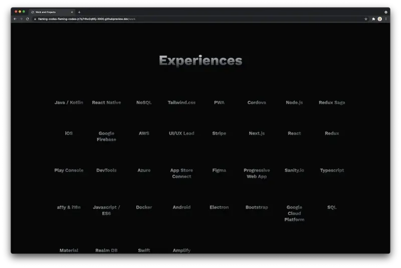
The grid of technologies
The following screenshot shows how the grid of technologies looks. It’s very minimalistic with a lot of negative space between the grid items. I used a gradient from almost black to silver, which provides a subtle premium feeling, in my opinion. Using only a single color, for example white, was somewhat too minimal.
By separating the technologies from the actual projects, I don't have to cram everything into a single view.
The grid of previews
After the user has scrolled past the technologies, a second grid provides more visual elements as well as information regarding my actual work. Each item shows a preview of a project I’ve been working on, both personally as well as professionally.
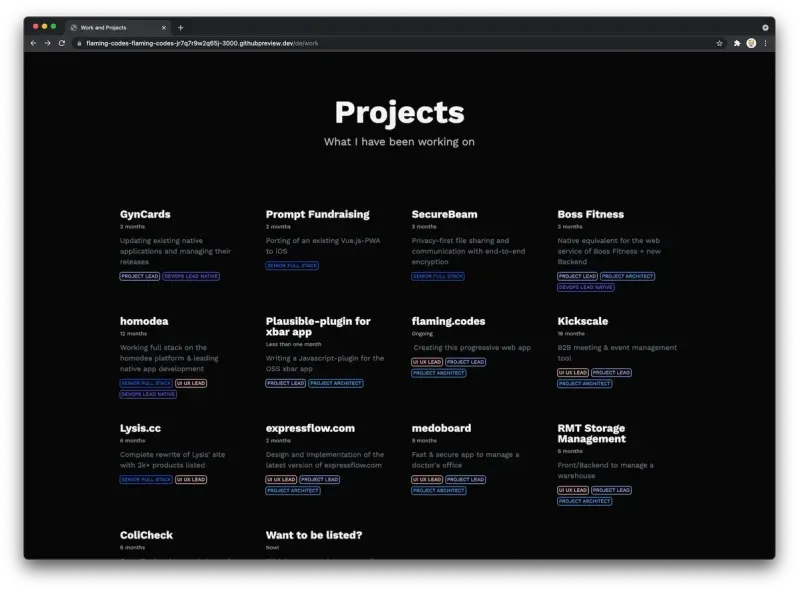
The most prominent visual element is the title itself, with the row of chips that show what roles I had at the project as the second most prominent one.
In Between those two elements are the label to show the project’s duration as well as a short description to give a quick information about the content of the project. The label for the duration uses the smallest font, as it’s the least important part of the preview, in my opinion - yet it’s still visible to users who explore this page.
The animations when hovering over grid items are reused and shared with other components of my progressive web app.
CTA in the previews
One major change from the previous, very simple version, was the addition of a call-to-action directly in the preview grid. I don’t expect that this action will actually be used, but I thought that adding it doesn’t have any negative impact on the previews.
Project detail page
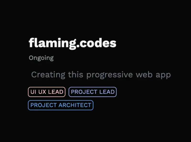
My goal for the detail page for each project was to provide all available information in a very structured and hierarchical layout. As you can see in the following images, the most prominent visual element is again the title, followed by the quick description as well as the specific technologies used in this project. The technologies are rendered as a row of chips, which provides a clear visual division between the header and the content of the page.
Below the header is just the same navigation row you find one all other pages that have a navigation element implemented (if you’re wondering, the page for a single blog post doesn’t have the main navigation bar, this is a separate UX study).
The place after the navigation row is reserved for the actual text describing the project. Here I’m using the same components for text-rendering as in the blog post pages.
After the user has scrolled past the project description, multiple rows are visible, showing even more information in a very compact and more stylized way.
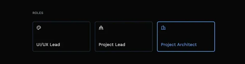
The first row gives a clear overview of the roles I had in this project, of course now larger than in the preview. As you can see, the colors for the roles are reused to provide visual consistency.
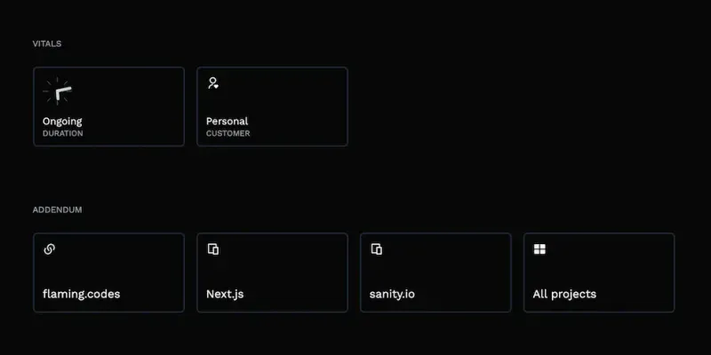
The second row is called “Vitals” and provides another set of key metrics of the project that don’t have to be written in prose each time, but are rather well suited for displaying as such larger information-cards. All vitals are animated when a user hovers over them, adding a nice UX detail to explore.
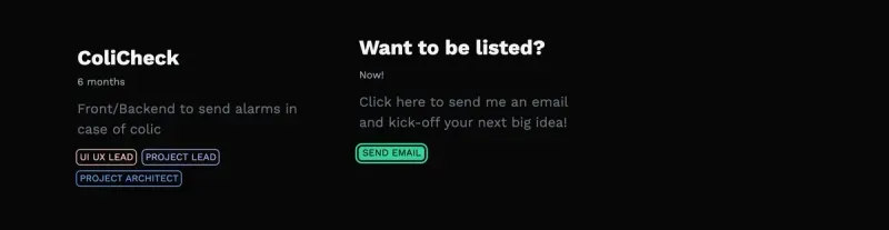
The last row simply lists all links to products or download pages relevant for the project as well as a link to all other projects.
Conclusion
As you can see, creating a portfolio page isn’t that much work. Putting some thought into designing the components pays off, as your digital representation of your work history has to provide a nice user experience.
Of course, this article is heavily opinionated, as only my decisions for my personal portfolio are reflected. Yet I think it can help you in designing your own web app as well as a special page for the projects you’ve been working hard on.