Columns never were that cool!
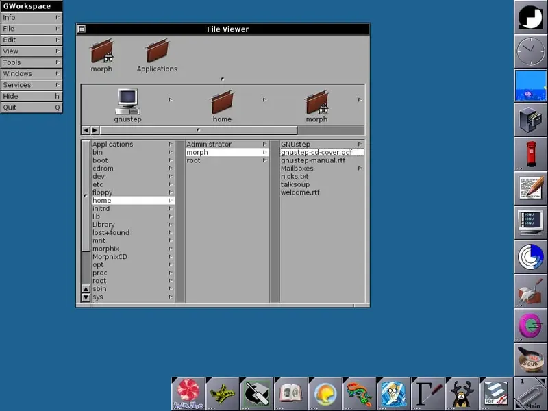
You certainly know them if you’re a user of Apple’s macOS but likely haven’t seen them that much yet: Miller columns. They’re a layout definition to show direct graphs of nodes, better known as your filesystem, in a column-by-column hierarchy, where each node has its own column with the contained children as content.
This sounds very technical, but the concept is really simple and can be explained in plain words: Instead of having to open a new window or tab for each directory you want to view, Miller columns open this new directory in the same window as a list view, contained inside of a column. The more directories you open, the more columns get created next to your current column.
A short history lesson
As with many innovations in modern user interface design, this concept has its origins in the early 80s. It was invented by Mark S. Miller and adopted by the forerunners of user interface innovation, such as the company NeXT, founded by Steve Jobs.
How they improve your app’s UX
The advantage of this concept is an easy to use navigation, where each action (opening a new directory) is visually comprehensible by the user. No matter how large a single column is, that is how many list items it contains, a user can just quickly navigate back inside of the filesystem by selecting a directory on the left side of the current column, as these columns were opened before. They work the same way as the concept of breadcrumbs.
Downside of Miller columns
One downside is that Miller columns require the user to scroll horizontally when many columns are visible. This disadvantage is mitigated by showing a horizontal scrollbar. Because users aren’t that accustomed to horizontal scrolling, it can still be considered a downside, but less so on devices with a touchscreen.