New viewport units
Up until now, 100vh was the largest height you could get for your CSS styles. The problem with 100vh is that it may actually show more content than is initially available on screen. A practical example you might think of is iOS’ Safari browser.
This now changes, as the standard is enhanced with small, large and dynamic viewport units. I only mentioned the height until now, but all those three size categories also apply for the widt. For simplicity, I’ll use the height throughout this article only.
Small viewport unit (svh, svw)
The small viewport units, identified by sv*, are aligned to the “small viewport”. This unit respects dynamically changing UI-elements from the user agent and essentially allows you to fill the viewport dimension when the the visible document content is its smallest size and the UI-elements are in their largest size.

An example would be Safari’s default UI layout when you load a page. The address bar at the bottom is expanded and takes up quite a lot of space. In this state, the user agent’s UI elements use the maximum of their available space and your page’s visible content is given its minimal visible size.
Large viewport unit (lvh, lvw)
Opposite to the small viewport, the large viewport results in a maximum value that fills the visible page when the UI is in its smallest variant and the page content at its largest. If this specification sounds familiar, it might be due to the fact that the current implementation for “vh” and “vw” acts the same.
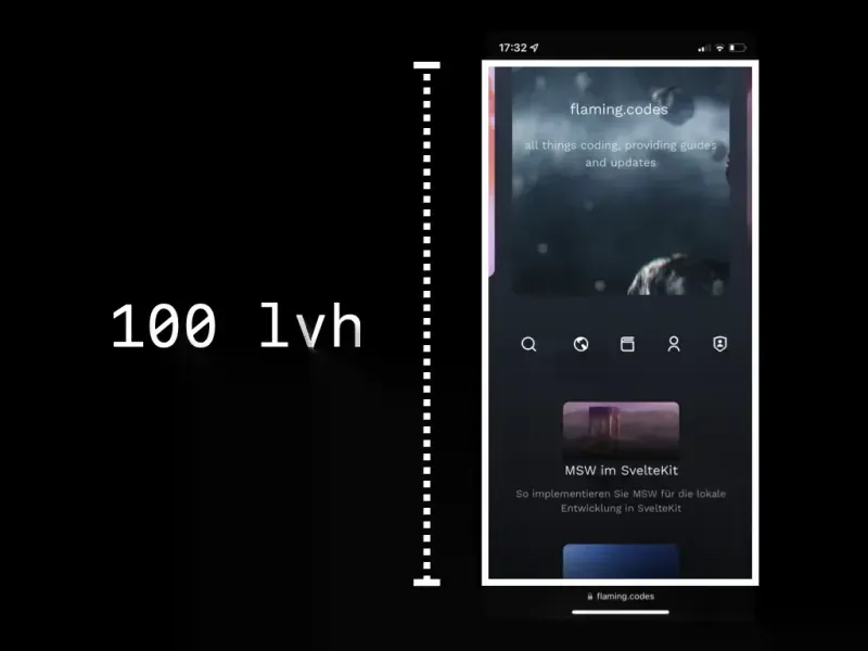
A practical example would be Safari’s view when you scroll down a little on any given scrollable page. As you’ll notice, the address bar shrinks, thus leading to the UI’s smallest visible footprint. Your content is given its maximum possible space in this state.
Dynamic viewport unit (dvh, dvw)
You might already have guessed it, the dynamic viewport units can possibly change when the user scrolls. They span at most the large viewport and at least the small viewport. This value can be quite handy if you want to align to the viewport’s height, but always keep your content visible, even if the user scrolls.
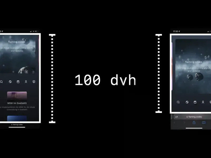
A practical example of such a use case would be directly on this PWA. Every “above-the-fold” section for an article keeps the footer aligned to the bottom of the viewport.
Availability
As of writing, these new viewport units are only available from Safari 15.4 and onwards. For Chrome, the feature is behind a feature flag, but not yet stable. Apart from those two browser, no other vendor supports the new units currently.