I've got problems
While enjoying this very web app of mine, I've always noticed that the content above the fold on mobile safari was somewhat broken. If you reload the page, you'll see that the first content loaded for every blog post contains the following items:
- Title of the post
- Subtitle with a short description
- Footer with author, category & date
This footer is intended to always be visible at the bottom of viewport upon loading the page, mimicking a magazin-like cover view. It looks nice, communicates a clear message (i.e. what this post is about) and avoids any deflections. This whole hero is implemented in a straightforward way by using the CSS-value height: 100vh, using all available height of the device's screen.
When the user scrolls down a little bit, this hero cover fades away making place for the actual content. Funny thing is though, this never worked on iOS. Here's what it looked like:
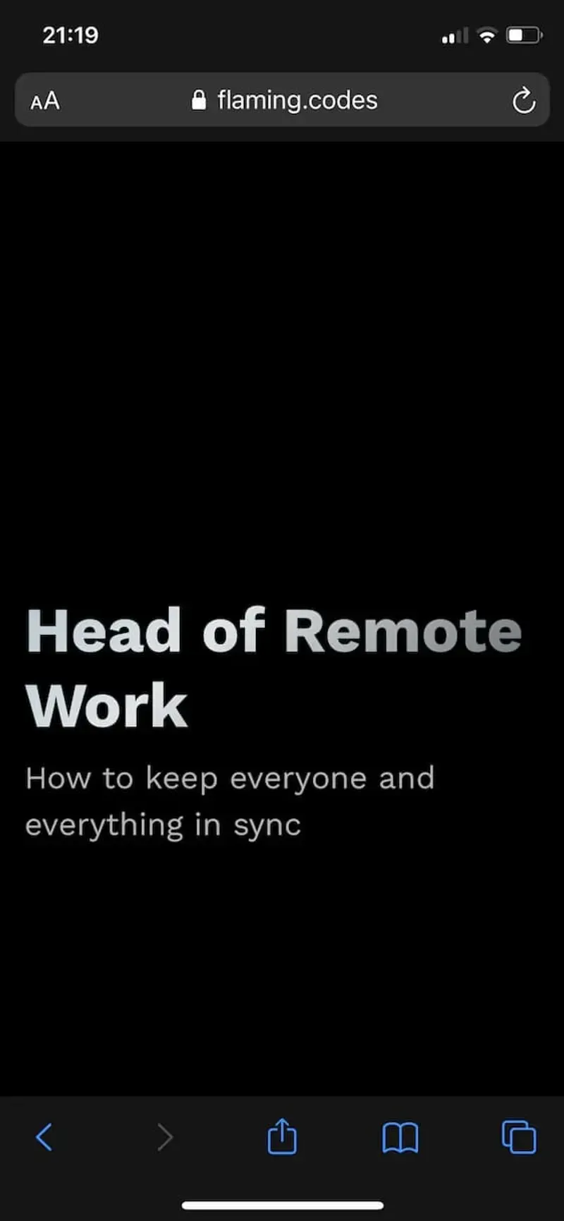
As you can see, no footer visible. In fact, it's hidden underneath Safari's bottom bar.
I have a solution
After putting on my sherlock hat and starting an investigation in the world wide web, I surely discovered a solution as others have had this issue before.
tl;dr: using Webkit's -webkit-fill-available does the trick. Here's what it looks like:
.hero-container {
  min-height: 100vh;
  /* fix for mobile webkit */
  min-height: -webkit-fill-available;
}
Yet using this as a template for my JSS solution didn't work out 100 %. The height only got reduced the container's intrinsic height. Therefore, I have to detect what device I'm on and conditionally apply the correct styling.
/**
 * Check if current session runs in
 * a mobile webkit instance.
 */
export function isMobileWebkit() {
  const ua = window.navigator.userAgent;
  const iOS = !!ua.match(/iPad/i) || !!ua.match(/iPhone/i);
  const webkit = !!ua.match(/WebKit/i);
  return iOS && webkit && !ua.match(/CriOS/i);
}

/**
 * As I'm using Next.js, window is undefined
 * on the server, therefore we need to call
 * 'isMobileWebkit' after mounting.
 */
export function useIsMobileWebkit() {
  const [flag, setFlag] = useState(false);

  useEffect(() => setFlag(isMobileWebkit()), []);

  return flag;
}
What's now left is the conditional usage:
// We're using 'clsx' for classname merging.
import clsx from "clsx";

function Hero(){
  const classes = useStyles();

  return (
    <div
      className={clsx(classes.hero, {
        [classes.heroCssWebkitFix]: isMobileWebKit,
      })}>
      ...
      </div>
  );
}

// ... slice of the styling:

const useStyles = makeStyles(theme => ({
  hero: {
    minHeight: "100vh",
    width: "100%",
    display: "flex",
    flexDirection: "column",
    alignItems: "stretch",
    paddingBottom: theme.spacing(2),
    paddingTop: theme.spacing(2),
  },
  heroCssWebkitFix: {
    // mobile viewport bug fix
    minHeight: "-webkit-fill-available",
    paddingBottom: 0,
  },
}))
Applying the fix above, everything works now nicely. Thanks for the read! Sources for the mentioned original posts below in the addendum.
- Tom