Designing an article page
When I started designing the layout, styles and hierarchy for the blog posts published on this web app, I had one major goal in mind: the content comes first. No ads, no pop-ups and no banners of any kind. I simply wanted the most minimalistic design possible to provide the greatest reading (and learning) experience possible.
The following key metrics were defined:
- no user interaction required at any point, for instance GDPR-banners, ads or CTAs
- a 100 % semantically sound HTML-structure so that every user can enjoy the articles, for instance when using a screen reader
- a minimalistic design that first and foremost puts the focus on the written text
- a great SEO-score so that my articles get ranked high in search engines, else writing them in the first place would be a task without any ROI
Layout of a content-first article
All following descriptions and decisions are purely personal and reflect my thought process on designing an article page. This is not a guide on how to do blog posts, but rather a learning for you on how I made it and if the results are worth it.
Alright, let’s talk about layout! If you’ve come this far, you’ve noticed that the page for an article differs quite a bit from other websites:
- there’s no top navigation row
- there aren’t really any interactive elements, it’s almost entirely the article text that’s visible
Here’s a bird’s eye view of the layout concept for a single article.
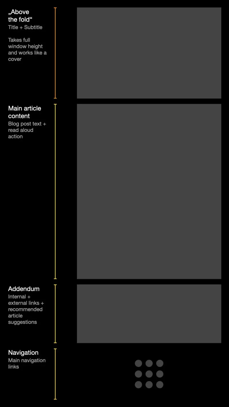
No top navigation
I avoided adding a main navigation element, placed prominently at the top or side of the page as many other web apps are doing it, to provide a fully immersive, magazin-like reading experience. This has the major downside that users who are interested and want to explore other pages don’t know where to look for them, which might lead to an increase in bounce rate. Bounce rate defines the percentage of users that didn’t navigate past the initial page they visited.
Yet for me, it is an experiment if users will still continue their journey on the site. It might be a wrong assumption, but I heavily weigh the suggested posts, which are visible after the main content. My current bounce rate among the last 30 days is between 70 % and 80 %, which is industry average for blog post sites.
The written word and nothing else
Each page has a first part, the “above the fold”-section, as it’s called, that takes the device’s full window height. It has a large title, smaller subtitle and some metadata and the window bottom. This design deviates quite drastically from most other articles pages on the web, as it’s basically the most minimalistic one I was able to achieve.
When a user scrolls down for a small amount, the “above the fold”-section becomes invisible and the main content fades into view. This provides a natural hint to the user where the page continues and what content on the page is now the most important.
The article content is centered with a nice reading width, as it’s common among many blogs. Code examples are important, therefore they get rendered in their own component, mimicking a window of the user’s operating system, together with a quick-action to copy to the clipboard.
The only interactive element, apart from links in the text, is the read-aloud button at the top, if the current locale provides speech synthesis as well.
The addendum
Directly after the article comes the section with some metadata. The first element here is a grid of all the locales that the article is available in. As this web app supports quite a few languages, the grid is relatively large. I’ve added gradients to each grid item, as this heavily draws the attention of the user to it, especially on the almost-black background. Most users that change the locale here just try it out, as they won’t continue their journey after the change.
Below the locales comes a row of simple feedback buttons, which are followed by the section for suggested posts. These suggestions are both a hand picked selection as well as a list of some posts published prior to the current one.
Users that have made it this far will then finally see a row of external links that provide more information on the topic as well as a row of internal links to the related categories for the article.
Navigation at the bottom
The most controversial decision I made was putting the main navigation at the very end of the page, where only the smallest number of users will ever see it. Note that this only applies for the article page. On other pages of this web app, there’s a prominent navigation row placed commonly at the top of the page.
I decided on this layout as I really wanted to test if this design can work at all. As written, my bounce rate is average, so at least it’s not a catastrophe. Yet I intend to change the layout in this regarding in a future update, so that the main navigation is both better and earlier visible as well as nicely integrated into the article page without any visual distractions.