UI & UX goals
My main goal with an overview page that shows all categories for published posts was to increase discoverability of the categories that are actually available. I also saw this change as an opportunity to enhance the visual beauty of the page as well as to align the UX with the other pages on this progressive web app.
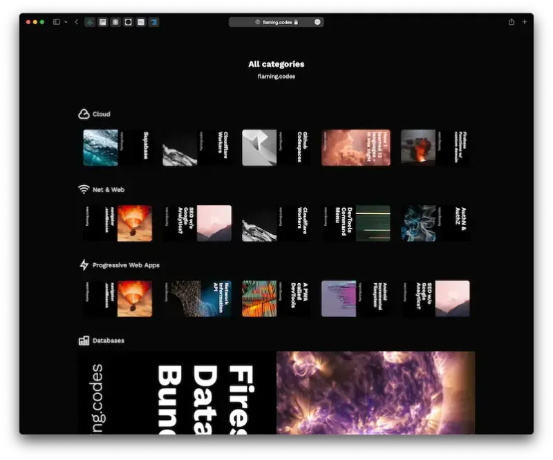
The following screenshot shows how the page looked before the redesign.

What had to change
The old implementation had two major issues. First, the layout was actually invalid, as categories with less than 5 elements scaled the available post-preview cover images up to fit the whole width. Second, there was no primary action bar visible at the top of the page - there should definitely be one rendered, as it provides main navigation elements to the user.
Furthermore, it becomes evident that the overview page for categories didn’t actually do a great job of making them visible. Instead, the user primarily saw cover images for posts that are related to each category. Only when taking a second look, the row with an icon as well as title of each category is recognized. Apart from being aesthetically not pleasing, this UI simply was badly designed.
Correcting mistakes
As this is my personal web app, I was also the one who messed things up initially on the categories overview page. Without any more excuses, I therefore sat down to rework the whole page.
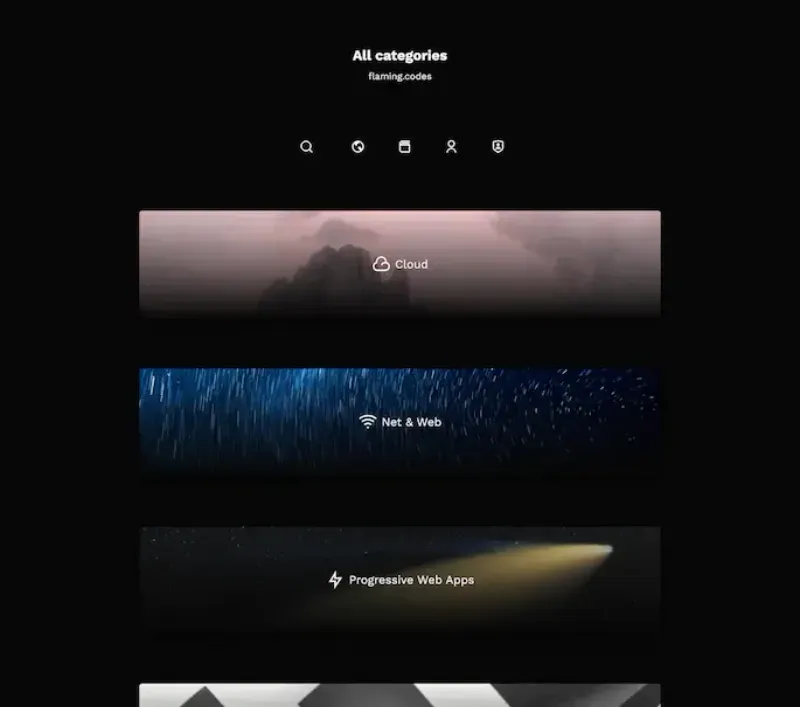
The new version shows a single column of rows, where each item shows a large preview image for a category. The custom image takes the whole allowed width. Centered on both axes is the category title in the middle, which makes it immediately visible and recognizable. To improve legibility, I added a subtle gradient from black to transparent underneath the text.
Upon hovering over the image and text, an additional info text becomes visible, showing the total number of posts for this category - an information that wasn’t previously available.
To fix the navigation issue, I also reused the existing action bar with all main routes available to the user.

Improving through iteration
To provide a more pleasant user experience, I also added a subtle scaling-animation to the image when hovering over a category row. As the image scales within its original boundaries, the view doesn’t unnecessarily grow.
Furthermore, a new row underneath the category image becomes visible through animation upon hovering over it. This row shows a selection of the latest posts for the category. Each post-preview is a link to the post. Every other interactive element in the category-row open the detail page for the category.
To give the illusion of more content than there actually is, I used Daisy-UIs “stack”-class to give each post-preview a faked stack to connote an impression of more preview-items underneath the current ones.

On small devices, no previews get rendered. A user can only click on the large category-image to go to the detail page, where all posts are listed.
Review and outlook
As you can see, even a simple page that only has to provide an overview of elements can be a source of both visual and conceptual errors as well as learning material on how to design a good and working UI as well as UX.
I didn’t add any local text search for users to filter by text input. For now, I intend to promote exploration on the page by scrolling as well as hovering. If this becomes an issue in the future (for example because users can’t find the content they’re looking for), I will add some filtering options. This might also become necessary as the number of posts as well as categories keeps growing. Of course, I welcome you to try the page out for yourself.
The source code
The following text contains the complete, unmodified code for both the page container as well the category groups. Everything is written in Typescript with React.js and Tailwind.css. If think you can reuse some parts, I' happy I could help you.
//
// Page container.
//

import React from "react";
import { CMSCategoryResolution } from "../../cms/entities/cms.entity.catgory";
import Reveal from "../Reveal/Reveal";
import { BogPostCategoryPostsGroup } from "./BlogPostCategoryPostsGroup";
import BlogPostCategoriesOverviewHero from "./BlogPostCategoriesOverviewHero";
import PrimaryActionBar from "../PrimaryActionsBar/PrimaryActionsBar";

/*
 *
 * Interfaces.
 *
 */

interface Props {
  categories: CMSCategoryResolution[];
}

/*
 *
 * Components.
 *
 */

export default function BlogPostCategoriesOverview(props: Props) {
  const { categories } = props;

  return (
    <div className="max-w-6xl mx-auto">
      <BlogPostCategoriesOverviewHero />
      <div className="mt-10 mb-20">
        <PrimaryActionBar isCentered color="white" />
      </div>
      <div className="px-6 mx-auto space-y-6 lg:px-0 md:space-y-16 lg:space-y-20">
        {categories.map((c, i) => (
          <Reveal key={i}>
            <BogPostCategoryPostsGroup category={c} maxPostsEachThreshold={20} />
          </Reveal>
        ))}
      </div>
    </div>
  );
}
//
// BogPostCategoryPostsGroup.
//

import React from "react";
import { CMSCategoryResolution } from "../../cms/entities/cms.entity.catgory";
import { FLPath } from "../../models/route/model.route";
import { CMSCategoryIconFactory } from "../CMS/CMSCategoryIcon";
import Link from "next/link";
import RiMore from "remixicon-react/MoreLineIcon";

/*
 *
 * Interfaces.
 *
 */

interface Props {
  category: CMSCategoryResolution;
  maxPostsEachThreshold: number;
}

/*
 *
 * Components.
 *
 */

export const BogPostCategoryPostsGroup = (props: Props) => {
  const { category, maxPostsEachThreshold } = props;
  const { posts } = category;

  if (posts.length === 0) {
    return null;
  }

  const url = `${FLPath.Categories}/${category.slug.current}`;
  const Icon = CMSCategoryIconFactory({ variant: category.slug.current });

  return (
    <div className="flex flex-col items-center group">
      <div className="relative max-w-4xl overflow-visible rounded-md">
        <div className="absolute items-end justify-start hidden w-full h-full px-6 space-x-4 overflow-x-scroll duration-500 ease-in-out translate-y-12 opacity-0 md:flex pb-14 group-hover:opacity-100 group-hover:translate-y-20">
          {posts.slice(0, 4).map((p, i) => (
            <span className="stack">
              <Link
                href={`${FLPath.Posts}/${p.slug.current}`}
                aria-label={p.title}
                prefetch={false}>
                <a className="duration-200 ease-out hover:scale-105">
                  <img
                    src={p.imageUrl.jpg}
                    alt={p.title}
                    loading="lazy"
                    className="object-contain h-20 rounded "
                  />
                </a>
              </Link>

              {Array.from({ length: 2 }, (_, i) => (
                <span key={i} style={{ width: 152, height: 80 }} className="bg-gray-800 rounded" />
              ))}
            </span>
          ))}
          {posts.length >= 5 && (
            <Link viewTransition passHref href={url} aria-label={`Link to ${category.title}`} prefetch={false}>
              <a className="flex flex-col items-center justify-center h-20 w-14">
                <RiMore />
              </a>
            </Link>
          )}
        </div>

        <div className="relative flex flex-col items-center overflow-hidden duration-500 ease-in-out rounded-md shadow-xl md:group-hover:-translate-y-20">
          <img
            className="object-cover w-full duration-500 ease-in-out group-hover:scale-105"
            width={960}
            height={200}
            src={category.imageUrl.webp}
            alt={category.title}
            loading="lazy"
          />
          <Link viewTransition passHref href={url} aria-label={`Link to ${category.title}`} prefetch={false}>
            <a className="absolute flex flex-col items-center justify-center w-full h-full bg-gradient-to-t from-primary">
              <span className="flex items-center space-x-2 duration-300 ease-in-out translate-y-2 group-hover:-translate-y-3">
                <Icon size="2em" />
                <h2 className="text-sm md:text-xl">{category.title}</h2>
              </span>
              <span className="text-sm font-light text-gray-200 transition duration-500 ease-in-out translate-y-2 opacity-0 group-hover:opacity-100 group-hover:-translate-y-2">
                {category.posts.length}
                {category.posts.length === maxPostsEachThreshold ? "+" : ""}{" "}
                {category.posts.length === 1 ? "post" : "posts"}
              </span>
            </a>
          </Link>
        </div>
      </div>
    </div>
  );
};